What’s behind the front page?
Article for the Guardian Beta blog:
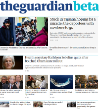
If you have two hundred years of newspaper heritage behind you, it’s an understatement to say your front page matters. The Guardian has an exceptionally loyal readership, manifested by the high proportion of online readers that pile straight in at the top, at www.theguardian.com. In contrast to a fleeting detour from Google or Facebook, their entry on our front page is their way of “buying the Guardian” - a declaration of faith in the Guardian’s world view.
Print newspapers have tried hard to carry the essence of their front pages into the digital domain. Even online-only news organisations (see Huffington Post) try to mimic the look and feel of printed broadsheets. Yet print and digital seem to differ enough to make this approach seriously challenging. The technologies, the timescales, the consumption patterns are too dissimilar. Not to mention every Google-eating SEO-monster data-driven aggregator out there that is competing for our readership. It’s their core competence and business model. The Guardian’s core competence is journalism. Our model in the digital domain is to promote our users’ instinct to head straight for the Guardian’s site – because of what it represents. The Guardian is not an algorithm - it’s a collection of humans with very strong opinions. Our site’s front page needs to convey that.
On top of all that, our readers’ expectations and behaviours shift apace with technological change. Mobile is becoming a dominant way of consuming news. News organisations are busy building responsive sites and developing mobile apps of every flavour. For front pages, the challenge of expressing an organisation’s voice in this new landscape has multiplied. Currently, at the Guardian, editorial intervention takes place in real time throughout the day, to craft the layout of our front and numerous section pages. This task however becomes less and less tenable when a page no longer has a single “layout” - but a proliferation of layouts across every screen size, every device capability, and in every app store.
Ironically - even though the challenge is to prevent front pages from looking automated - far greater automation of layouts is now required. Templates can no longer be “dumb”; they now take on the burden of making pages look great across the whole range of possible screen dimensions. From an editorial perspective, decisions about layout need to be largely replaced by broader decisions about journalism. Because that journalism will emit across every platform simultaneously. If that can be achieved, the good news for editors is that their time is hopefully freed to make more such decisions, more often, across a broader range of content. A richer yet more unified voice becomes the focus of their editorial day.
Technically, there are four parts to this. First, a content strategy and data-model for all our fronts that captures the variety and volume of Guardian journalism. Second, editorial tools that allow rapid and informed editing of these fronts. Third, a central source of frontpage data that can syndicate to all platforms. Fourth, per-platform layouts to render this generic data as beautiful front pages, optimised for each given platform.
Let’s take them in turn. Our new data-model’s building blocks are really just simple lists of content. Each can be configured to serve a specific editorial role, can be manually curated and/or pulled from an automated data source, assembled with arbitrary other lists into front pages, tweaked in various ways, and reused wherever needed on other pages across the site. It’s an evolvable vocabulary to express the Guardian’s content strategy at any given moment.
The tooling work replaces tools that are historically tied to a fixed desktop-sized layout. Instead, a new and simpler tool is decoupled from layout considerations and allows a focus on editorial decision making and the ability to use performance metrics. It is designed for a fast learning curve and allows multiple users to concurrently edit fronts, or a wider range of fronts than they might have previously. Easier tools create more things, faster.
For the content store, the Guardian already has a “Content API” that acts as a central source of layout-neutral article data, and which drives our emerging responsive site and diverse native apps. The data gets aggregated into front and section page data – as these are edited in real time – so that editorial decisions can be syndicated and synchronised across all our platforms and present a unified Guardian story.
Lastly, the per-platform templating work is the greater part of the task – encompassing multiple projects, products, and their ongoing iterations. The overarching point is that with a unified data model and single source for frontpage data, the design and development task for any specific platform is more defined, has less to invent and build anew, and delivers an on-message result. We have already seen the benefit of this approach across the projects that now depend on the Content API for article data. It works.
This is an architecture for products and front pages that act in unison to differentiate the Guardian’s voice. It’s early days but the framework is in place. Our editors are now curating pages of our beta site using experimental and evolved ideas about how our unique journalism should be featured and promoted. The aim: to continually remind new and existing readers why they prefer the Guardian.